Every year people spend thousands of dollars upgrading our lives. From the cars we drive, to the clothes we wear, to the houses we live in. We want the best, up-to-date styles, and let last year’s fads slip into sweet nostalgia. One thing that we often overlook, however, is popular trends in everyday marketing design.
At one point in the history of the world, Comic Sans made its debut as a popular, informal document/childrens materials font. Thankfully, the world one day decided that it was time to put it on a shelf and leave the style in a box labeled “not for reuse.” That’s exactly what needs to happen with some trends that still make their way into popular culture and common designs.
To help sort it all out, here are 5 design trends that we don’t feel make the cut for 2019:
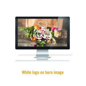
1. White logo on hero image.
It has become a staple in website design to cover a landing page with an image and place a white logo on top. This trend is problematic for a number of reasons. First, it doesn’t always execute the way intended. Sometimes visibility becomes a major issue, and sometimes things blend way too much into the image itself. Especially when text is involved. Second, it doesn’t lend itself to creativity. It is very simplistic, and doesn’t exactly benefit your brand identity. This is one of those moments where you should be trying new things and thinking outside of your comfort zones.

2. Using Premade Branding
Avoid “brand creators” on websites and “$5 Logo” creation sites. While this isn’t exactly a visual trend, it lends itself to a whole world of disaster for your brand and in the eyes of design professionals. Creating a brand is something that should be cultivated, inspired, well thought out, and unique to your company. After all, you are spending your time, energy and hard-earned money on your new passion-project. A $5 logo isn’t going to read “Revolutionary” to your customers/clients.

3. Rounded Corners
This simple little tactic has been used since the early days of button design, and it has been effective on many platforms for a very long time. However, like Comic Sans, it’s time has passed and simply isn’t in good taste anymore.

4. Vintage Badge Logos
There is a time and place for everything, but as for this design trend I feel like there may be a little less time. Over the years these badges have been seen everywhere. From Bar Menus, to etsy shops around the nation. Even though they may still work every so often, you can’t deny they are seen A LOT. This becomes troublesome because when it comes to brand recognition, it often means your company losing its brand’s individuality.

5. Regular-Sized Print
Being that it’s 2019 and the world is at our fingertips, our everyday printed materials are becoming less and less acknowledged. Regular size business cards get shoved into wallets/purses and forgotten about every single day. So why are we still using regular printing sizes? Plenty of companies and printing websites offer square business cards, tall/skinny flyers, mini postcards, etc. These designs really can be impactful and with the world we live in: there is way less of a status quo on printed material.

While this list is completely our opinion, and not everything will stay in the “Not For Reuse” box forever, it’s extremely important to remember to push yourself in the world of design. In order to do that we have to say goodbye to some of the things we have become comfortable with. So, the next time you sit down with your professional designers to work on your brand, or even just the next time you look into your closet, ask yourself: should this stay in 2018?

