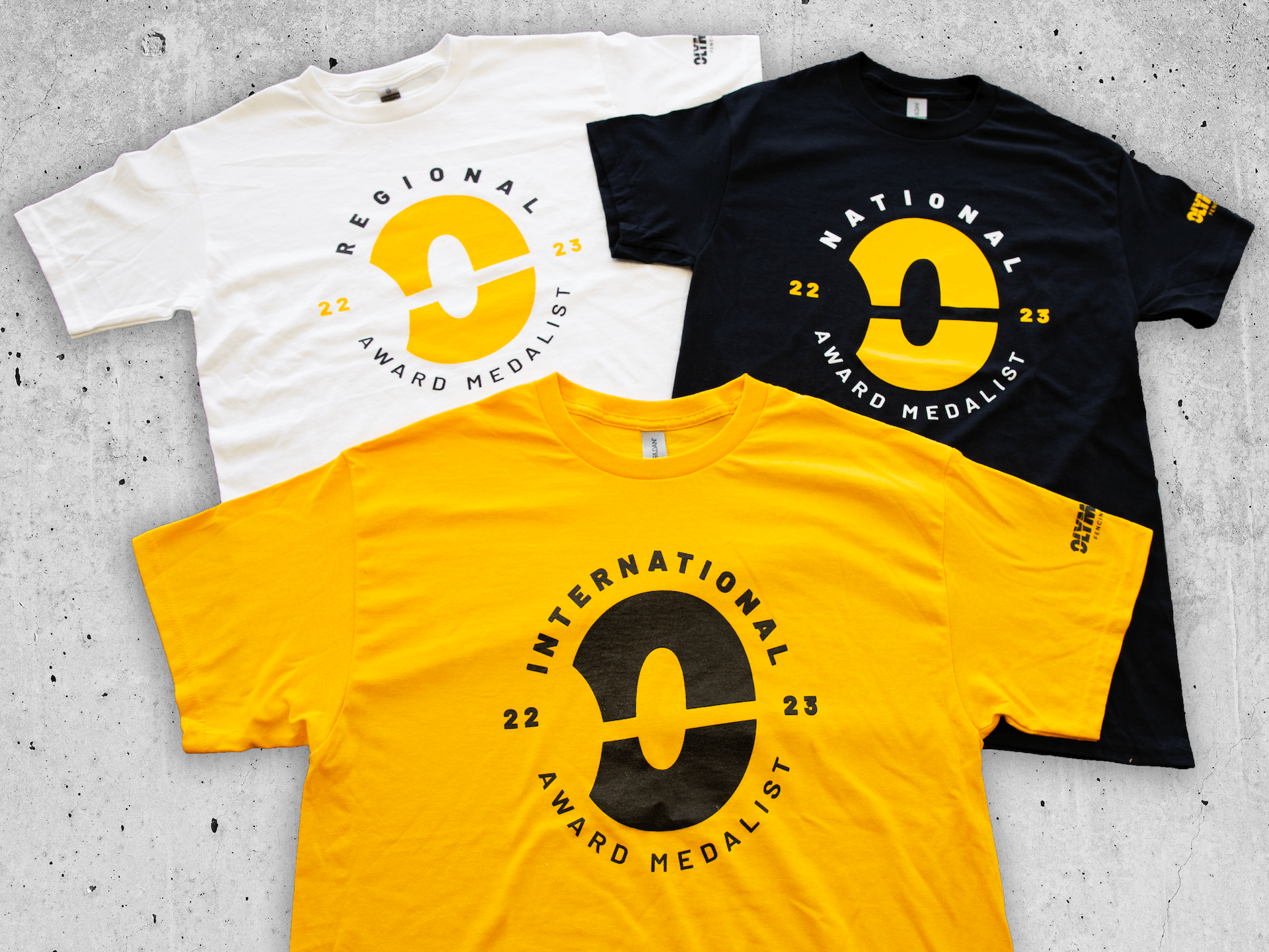
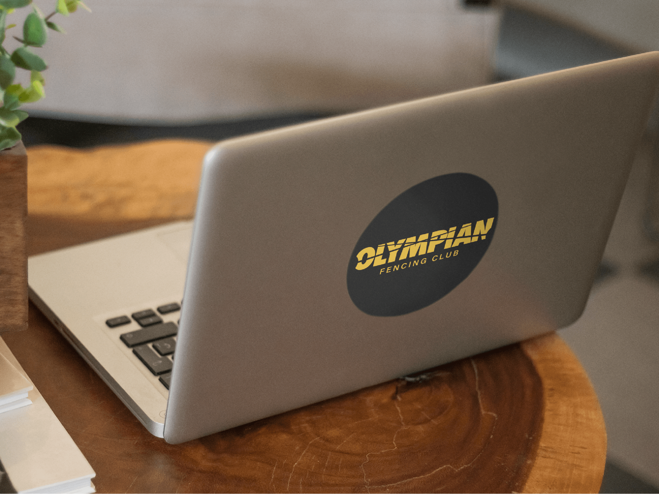
Olympian Fencing Club, a training ground for fencing champions of all ages since 2010, underwent a transfer of ownership in 2022. With the objective of increasing awareness of the both the club and the sport in San Antonio, the client hoped to modernize the look and feel of the Olympian brand across customer- and partner-facing platforms. After consultation with the client, Public Alliance developed a bold logo and a fresh color palette of black and yellow that embodied the competitive excellence inherent to the client’s activity and business strategy. The client’s previous logo contained overt references to the Olympics, such as a laurel wreath and the silhouette of a disc thrower. We chose to refocus on the sport of fencing itself and to allow its face-to-face nature to emerge through the logo as negative space in the form of opposing epee swords. The font stands tall, while the épeé swords quickly communicate our bold, new approach. This logo and the overall theme of competition was then applied across the client’s key mediums.
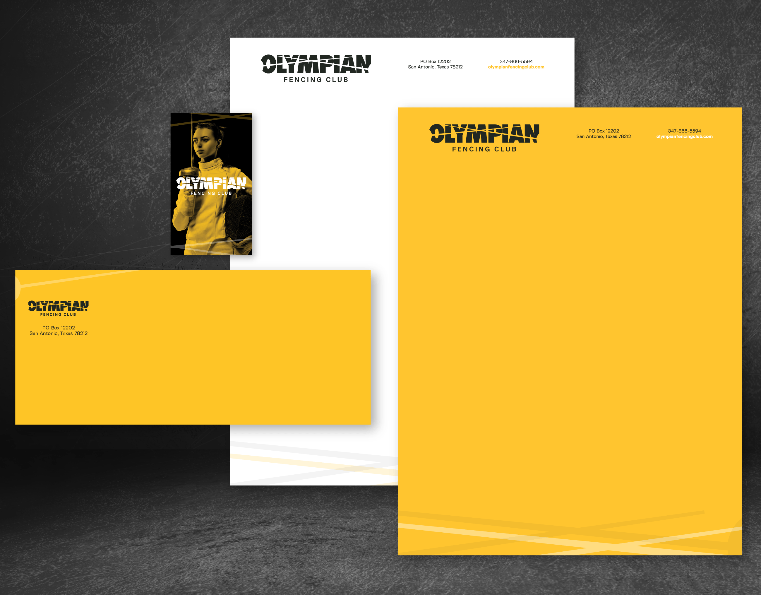
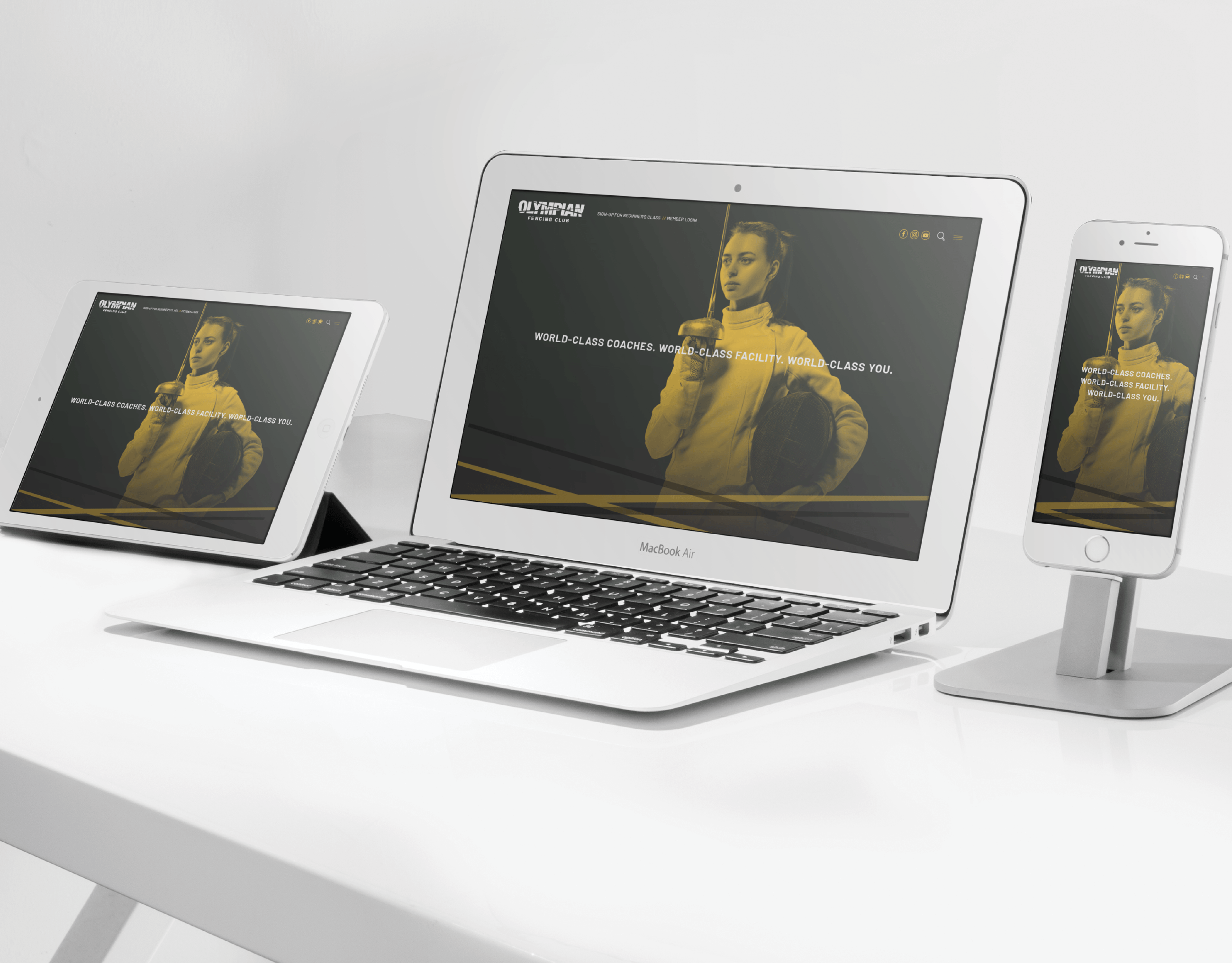
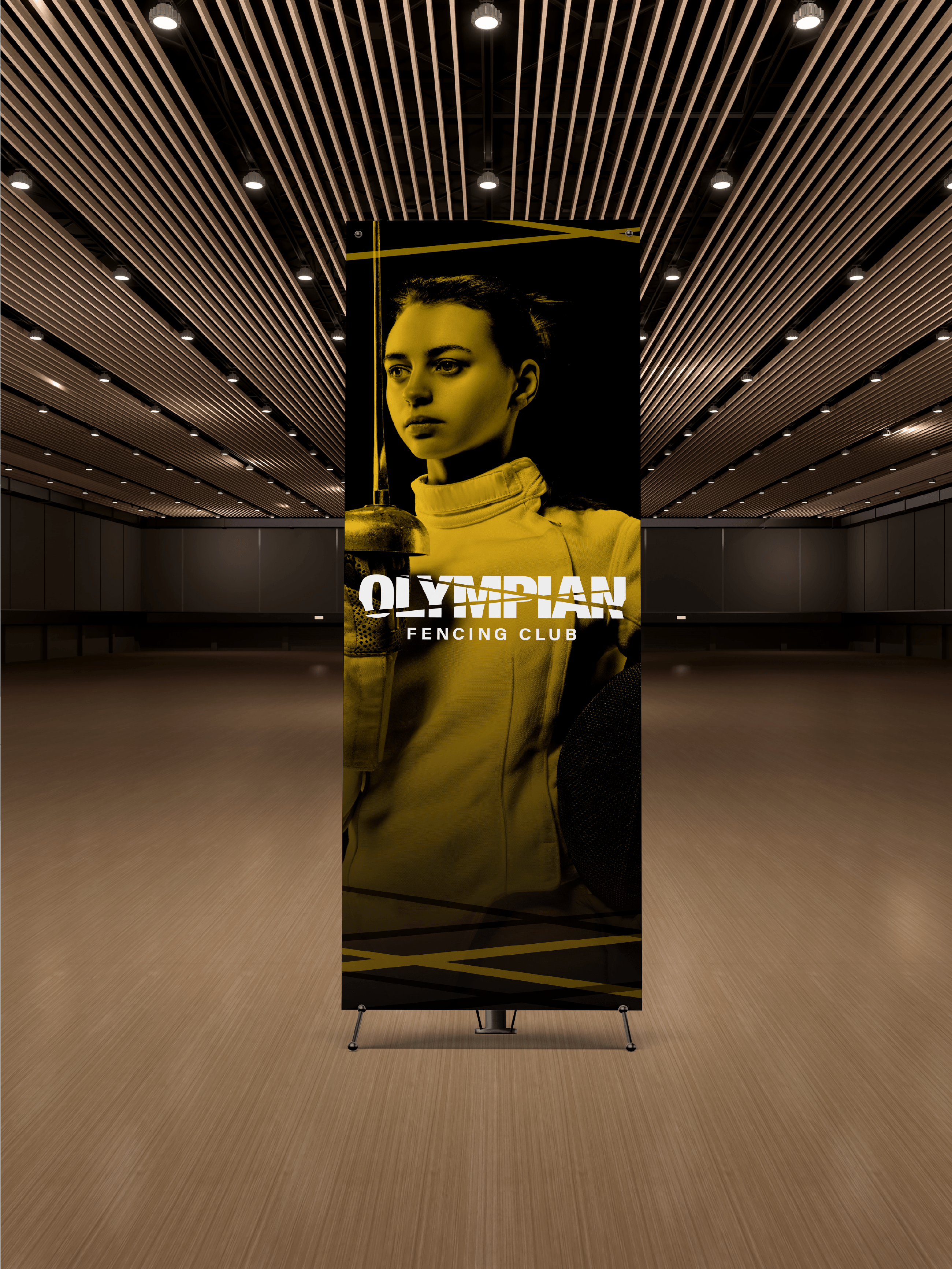
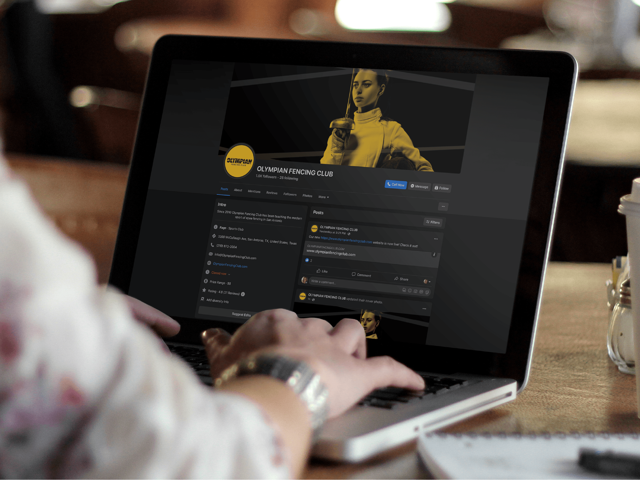
In reimagining the entirety of the company’s website, we leveraged these opposing swords on hero images, as well as photos of fencers either in motion or in mental preparation for a bout, to communicate the unique dynamic action that the club’s members perform. Public Alliance also designed eye-catching stationery in the company’s new recognizable yellow and black and adapted the new branding to collateral pieces.